
Applying Photography's 4 rules of composition to Ingres Portrait paintings
Could this be a more helpful way to understanding composition?

Let’s see if we can use photography’s composition tips in portraits.
A fun new experiment and research I did while putting two different ways of seeing the world together!
We’re going to take a look at these two portrait paintings by Jean-Dominique Auguste Ingres with some Photography eyes!
The two paintings we’ll be looking at are":
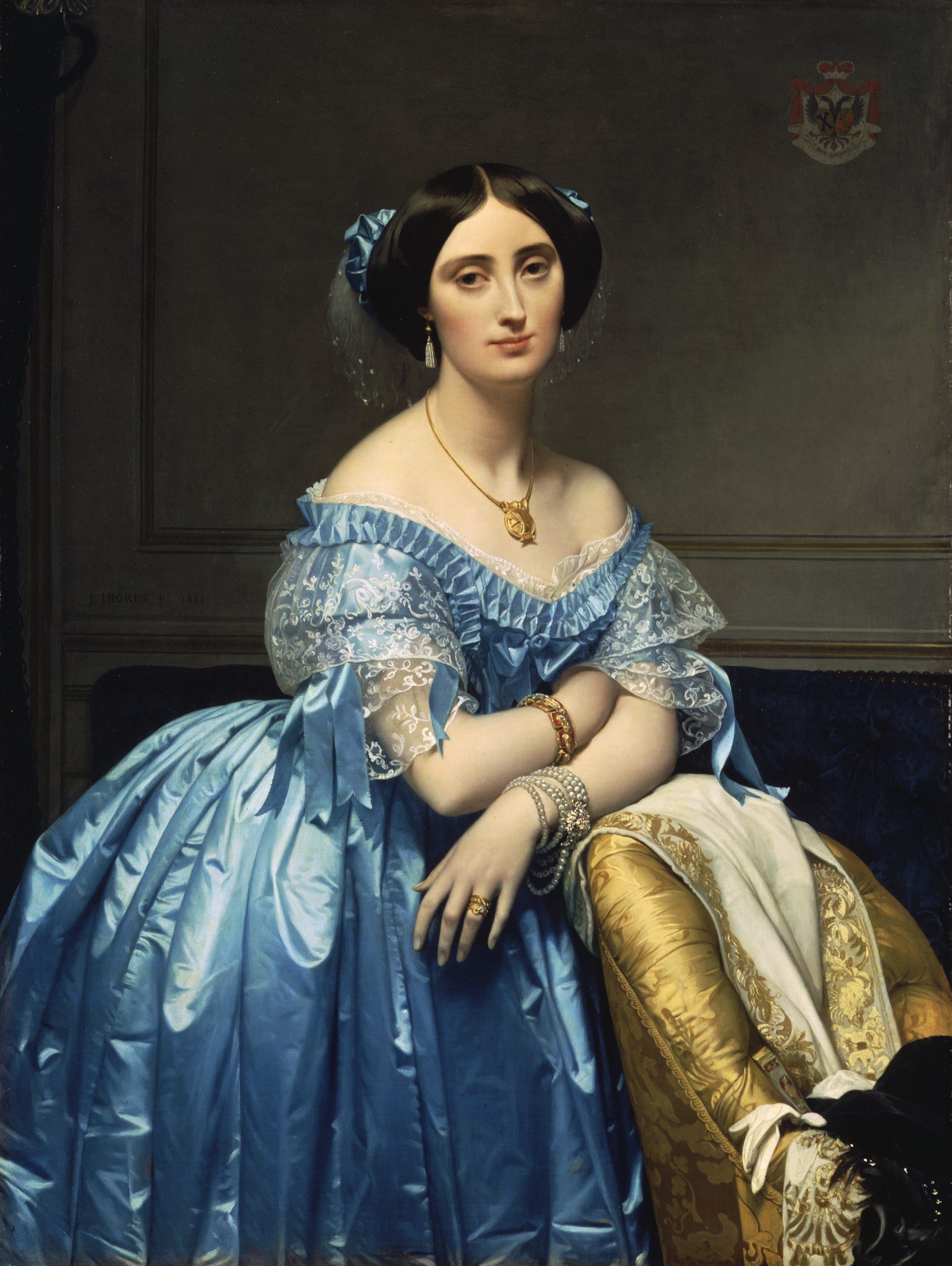
Joséphine-Éléonore-Marie-Pauline de Galard de Brassac de Béarn
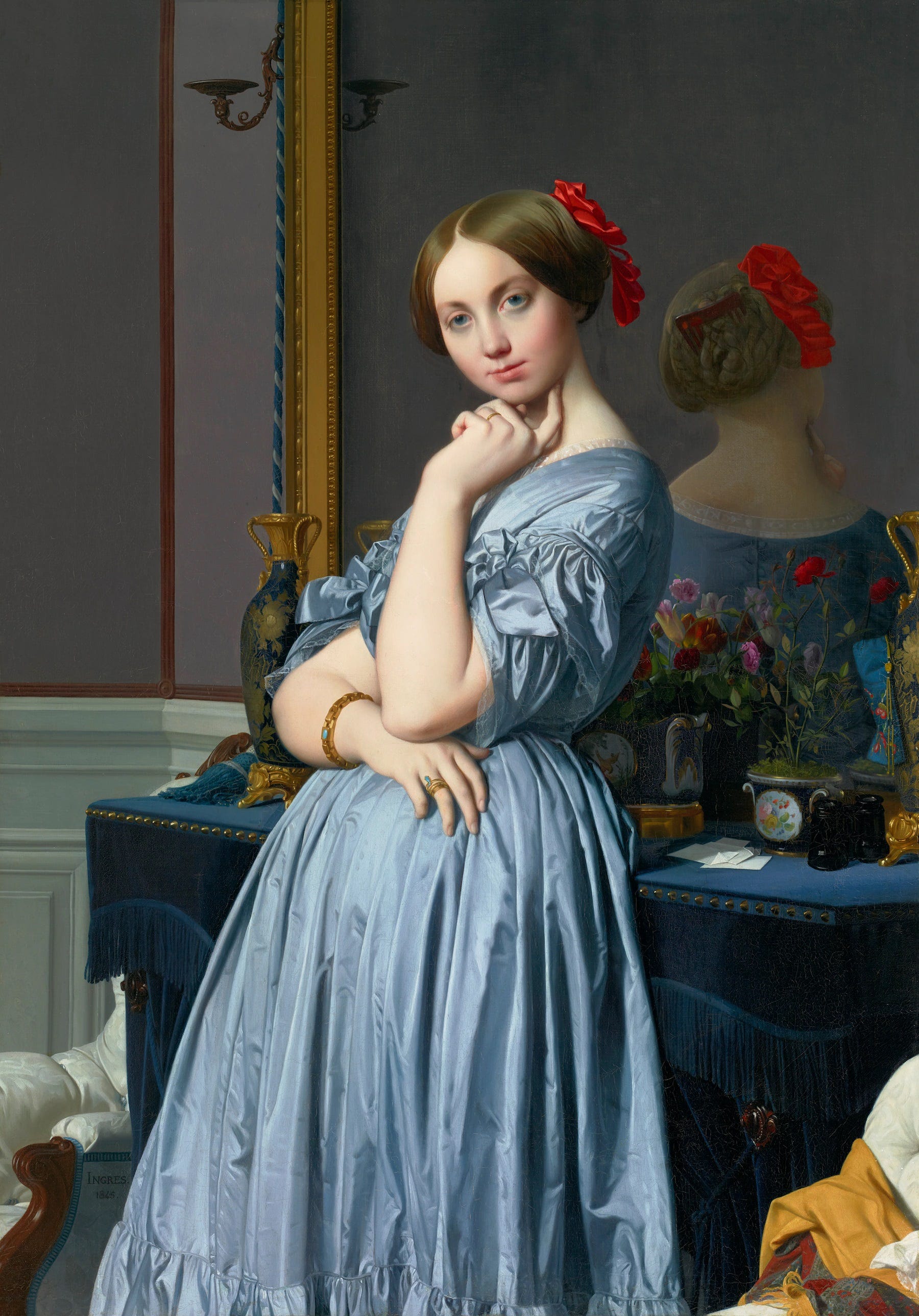
Countess d'haussonville
I recently got into Photography and learned more about the arts and crafts of how photographers compose their pieces. After learning those tips, I was like “What if we could use this in fine arts and portrait paintings too!” And here starts a new adventure!
The 4 Rules of Composition
After watching Nigel Danson’s tutorial video about “The 4 rules of composition” He pointed out 4 main things to keep in mind while creating your images for Photography.
Balance
Flow
Energy and Dynamism
Depth
Balance
Let’s take a look at how well the balance is in these 2 Ingres portrait paintings. Balance can be depicted using numerous different methods. One is the direction of the line. The other is colors and shapes to balance off the picture.
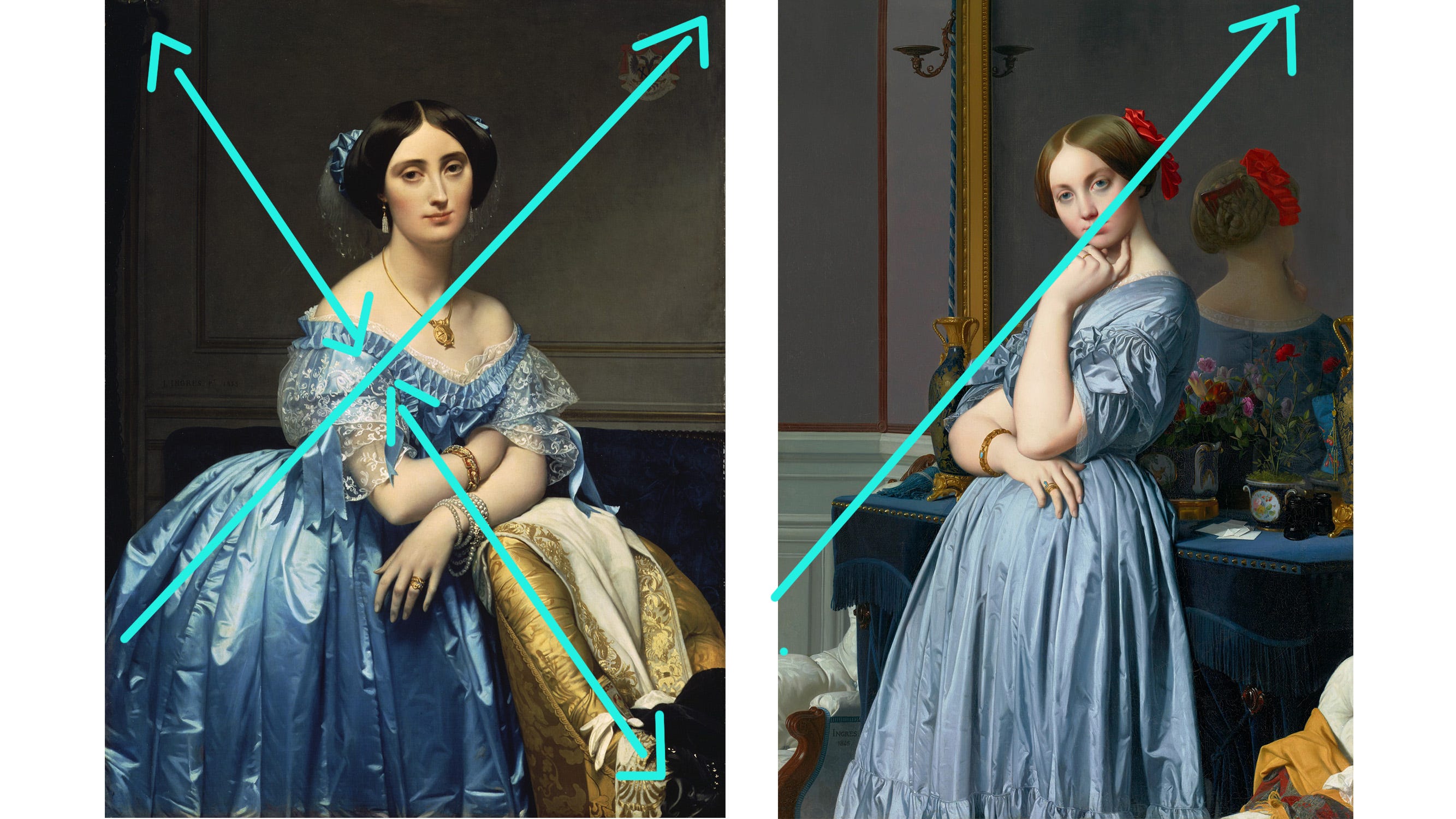
Joséphine: This painting has a very nice balance. Ingres used lighting as the element to create balance in this painting. Creating a diagonal line from the bottom left to the top right corner. It evenly balances out both sides of the painting. And to support it even more we also have another diagonal line that directs us through the painting from the sofa/chair to the top left corner of the room.
Countess d'haussonville: Ingres also used the lighting as the element to balance off the painting on both sides. Giving good harmony and stability to the painting
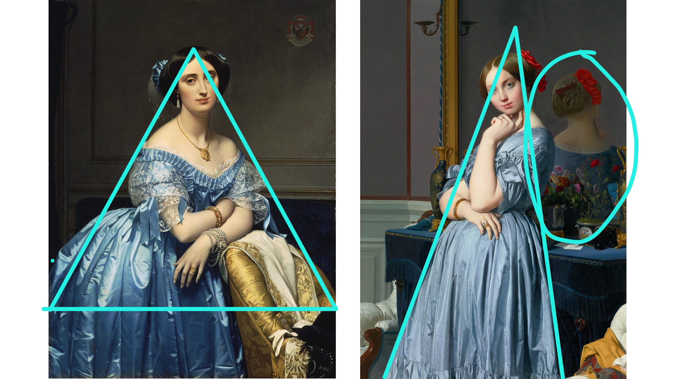
Joséphine: Another great way to balance off this painting is the shape and pose of the figure. As you can see, Joséphine has this large triangular shape which creates a stable and even balance for the figure.
Countess d'haussonville: Ingres used something a little bit different for this one regarding shape as balance. Since the triangular shape of the figure is a bit more narrow. To support it, we have the reflection of the Countess on the backside in the mirror. Another shape to balance out the painting so the figure doesn’t topple over to the right side.
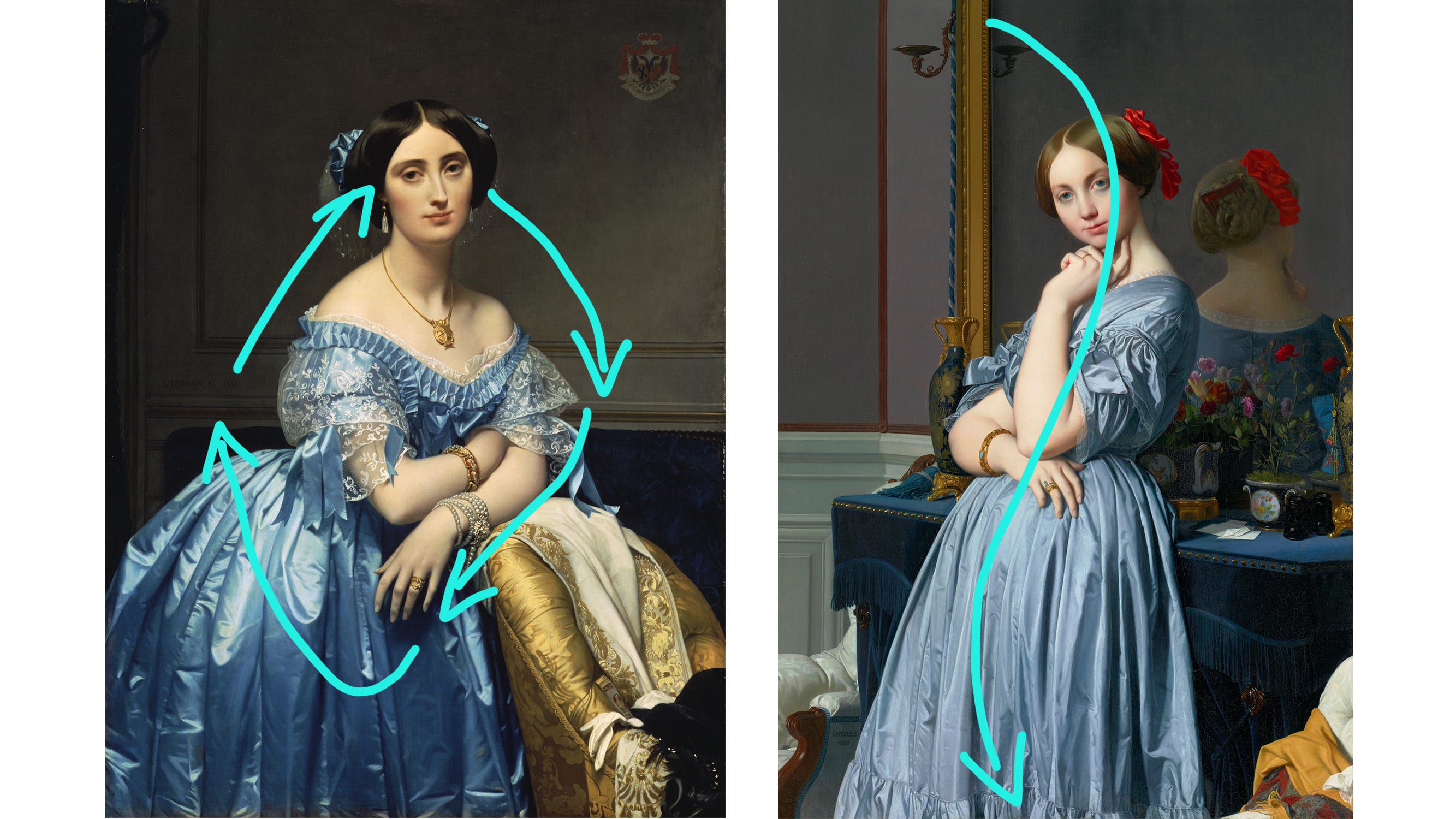
Flow
Joséphine: The flow in this painting is very continuous, like a returning cycle. Mostly the area where we gaze at the face and move downwards to her arms, then to the dress, and back again to the face. Keep this cycle going.
Countess d'haussonville: The countess has a smoother curving flow. The main line that goes through and follows the natural curve of the figure. Mostly with the support of the arm and hand gestures and the figure slightly leaning towards the back table.
Energy and Dynamism
Now let’s see how this painting evokes energy and brings it to life! Nigel mentions a few elements he would use as a photographer to depict “Energy” In a picture.
Water
Clouds
lighting/movement of momentum
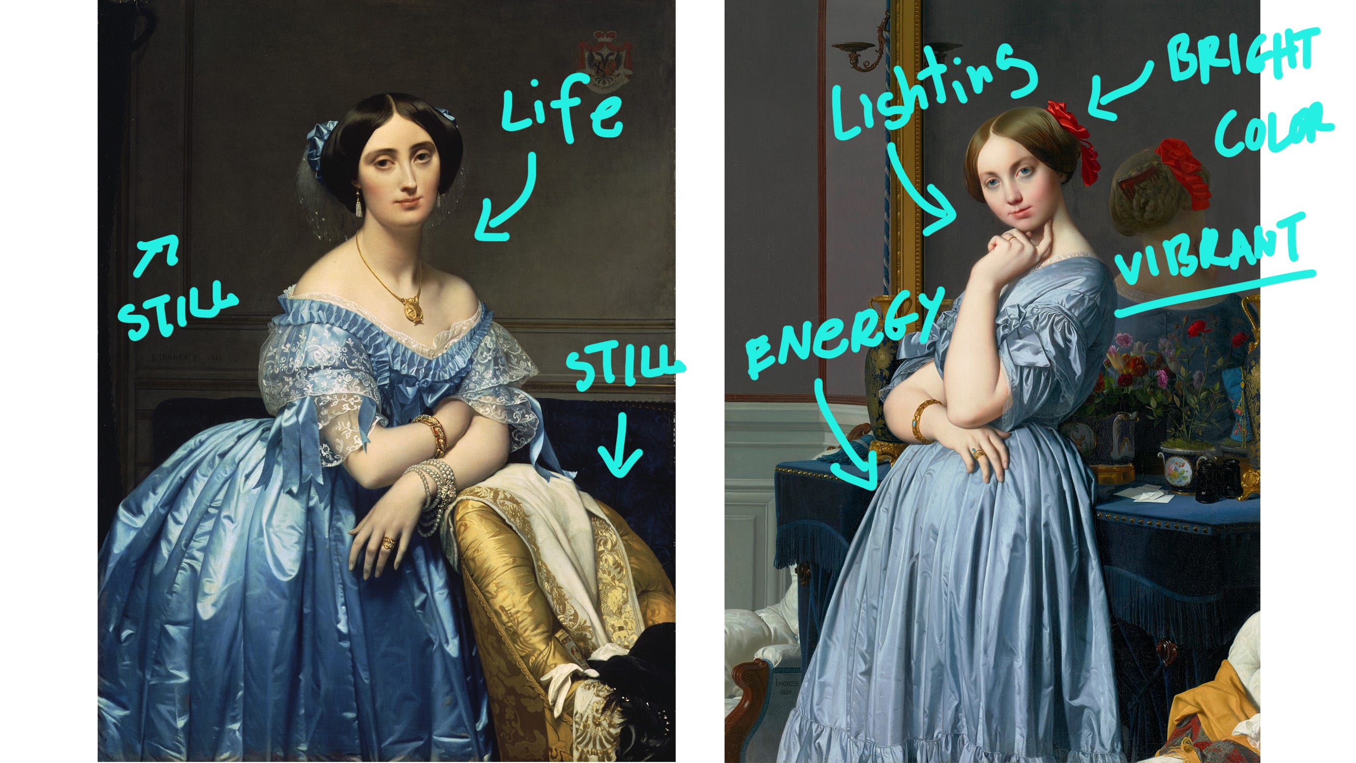
Joséphine: Ingres Energy mostly comes from color. Since the artwork itself already has 2 elements to depict something still and static (Which is the room, and furniture)and the other that’s filled with life (Which is the figure). So adding an extra touch of color and lighting. With the two combinations, really make the piece come together and make it pop and get filled with energy.
Countess d'haussonville: Simillar method with the Countess. Ingres used brighter and more vibrant colors to bring contrast between neutral and low-key backgrounds and the warmth and liveliness of the lady in the painting. Breathing life into the painting.
Depth
Nigel mentioned how he depicts “Depth” in his landscape photography. Having something take and guide us into the picture. It’s the equivalent of “perspective” when we talk about painting and art. So bringing depth into the painting or picture and not just a static and flat surface/dimension. You can have elements in the foreground and in the middle and background to build the layers that way.
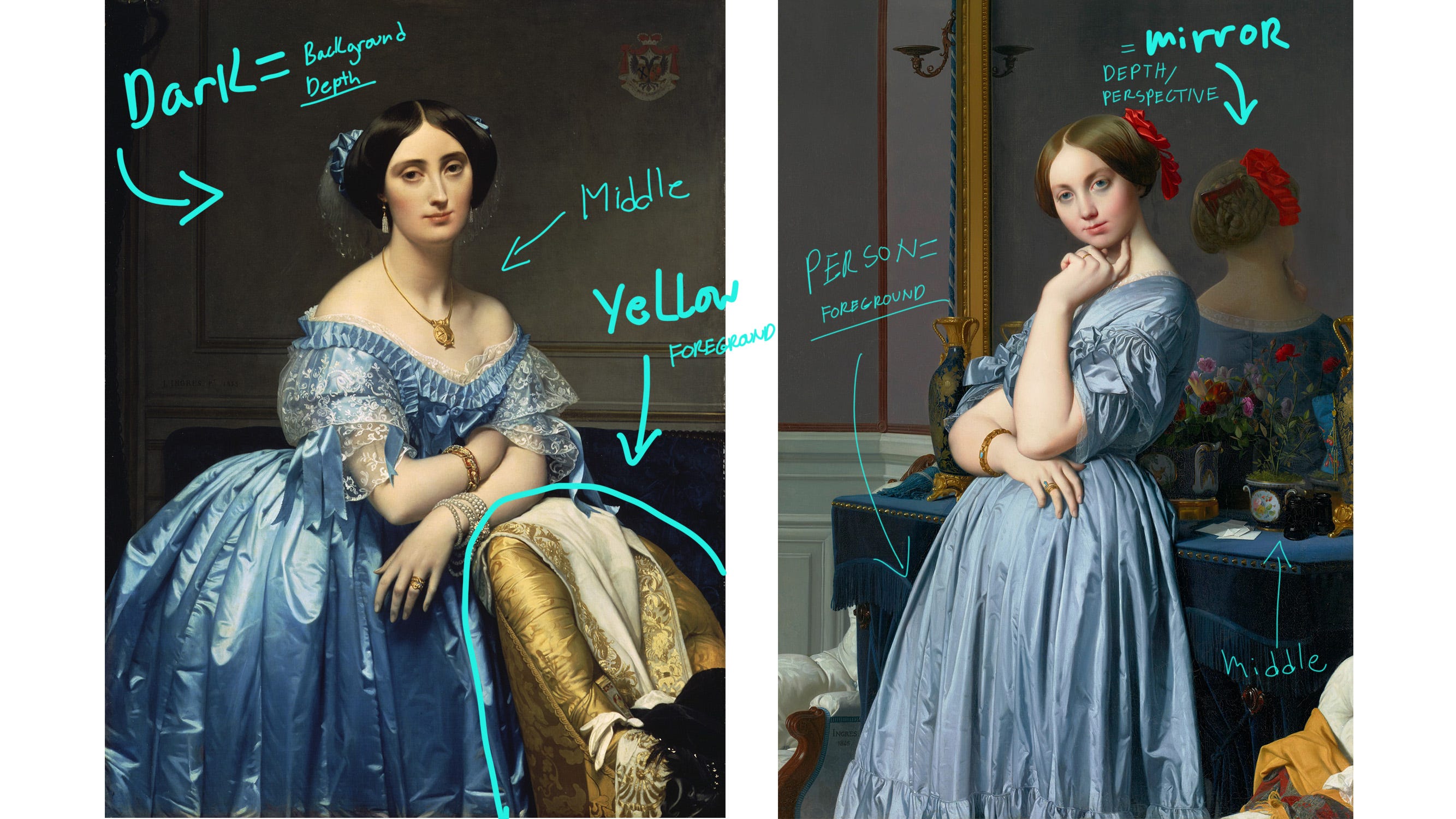
Joséphine: Ingres's way of depicting depth or perspective is very similar to how Nigel would use to compose his pictures. The yellow sofa in the foreground would be the first layer and starting point of the “depth” we’re creating. Then it leads us to the middle ground where the figure is and then brings us deeper and further into the dark background.
Countess d'haussonville: The Countess’s way of depicting depth is by using the reflection in the mirror. Since the person is in the foreground and then the furniture and table are set in the middle ground and in we go! Into the depth of the mirror as it reflects a deeper space and dimension within it.
I hope you enjoyed this new way of seeing portrait paintings and using photography tips to help us better understand the composition and how we can improve and add it to our own works of art. I find it fun to think outside of the box!
What did you discover?
I’m curious to see what your thoughts are on using photography tips on composition in these 2 portrait paintings and if you also discovered something new. I would love to know! (You can comment and share your thoughts below!)
Thank you for reading my fun little discovery and I hope you also get to learn and share your discoveries too!
You can also share it with fellow friends, artists, and cellists of today's Victoria Yu Art on social media, forward it to someone who might benefit, or text it to a friend. Thanks for reading!
PS Feel free to watch my new YouTube video about this new post! Sharing thoughts and ideas!