


Did Corot and Da Vinci have a connection?
Discovering the inspiration that could have sparked between a series of portrait paintings.

Did Corot have any connection with Leonardo Da Vinci?
That’s the question we’re going to ask ourselves today!
By looking at a series of portrait paintings, I’m going to share what I discovered while I was researching one of Corot’s portrait paintings and this is the one that started my journey and adventure finding some hidden secrets!
Let’s meet “The Woman with a Pearl by Jean-Baptiste-Camille Corot”
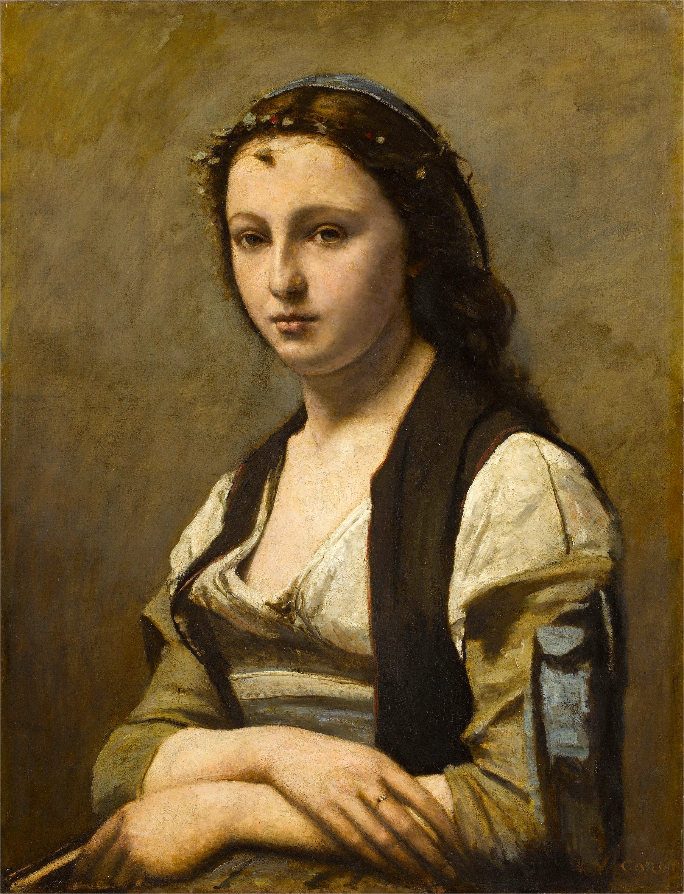
This research started when I was learning about Corot’s great impact on his Italian Landscape paintings. And I was amazed at the execution he has with his painting skills! Very fascinating. I was curious to see if he did any portrait paintings as well (Which he did many) But I came upon this particular one (Which is the lady above) and I was very intrigued. It caught my attention.
Mona Lisa Vibes
The first impression that came to me was “Ooh! It’s got some Mona Lisa vibes to it!” Mostly when you see the hand position of the two portrait paintings.

But they are still a bit different since in Corot’s portrait, her hand is further apart. Mona Lisa’s hands are on top of one another.
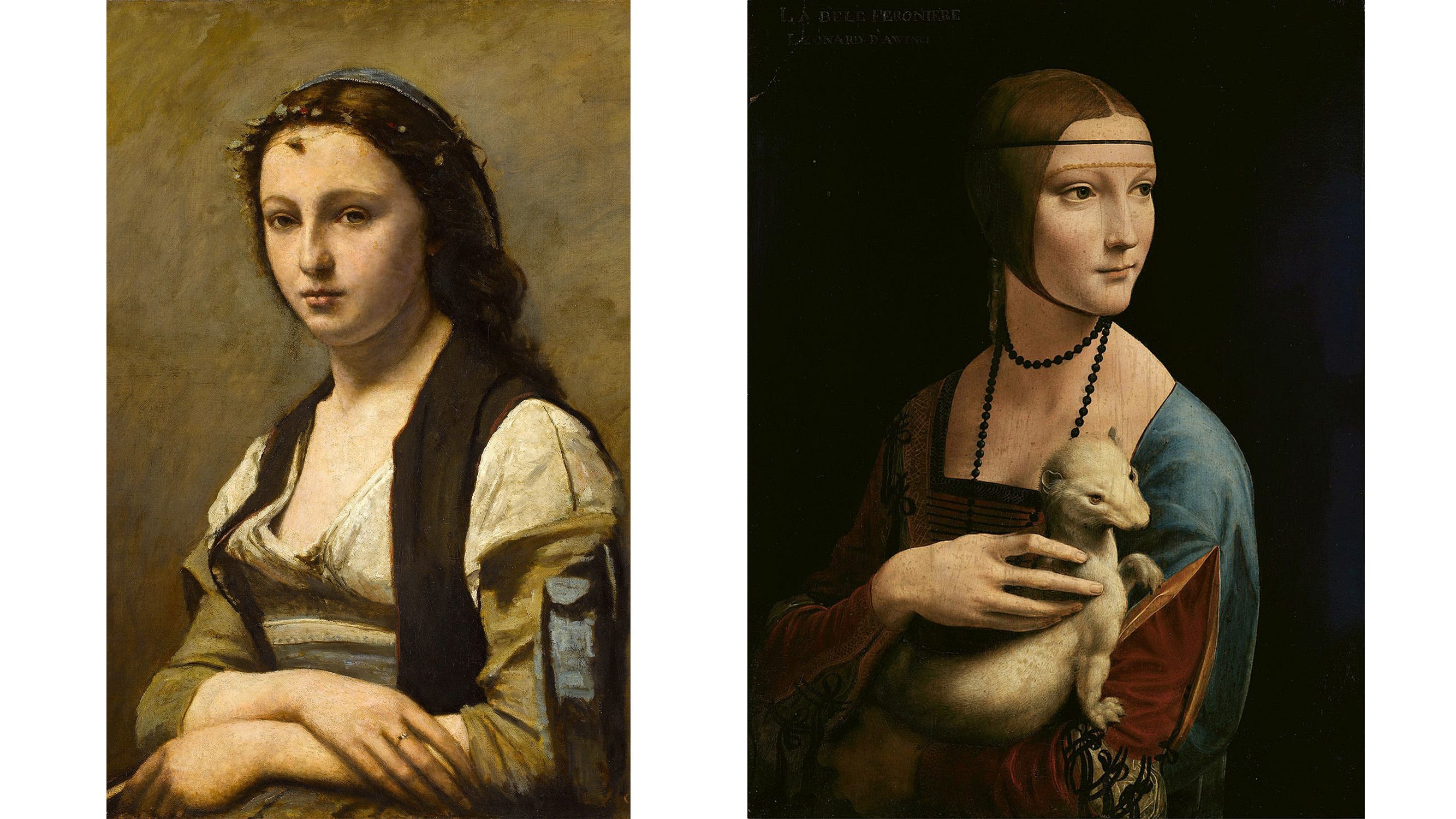
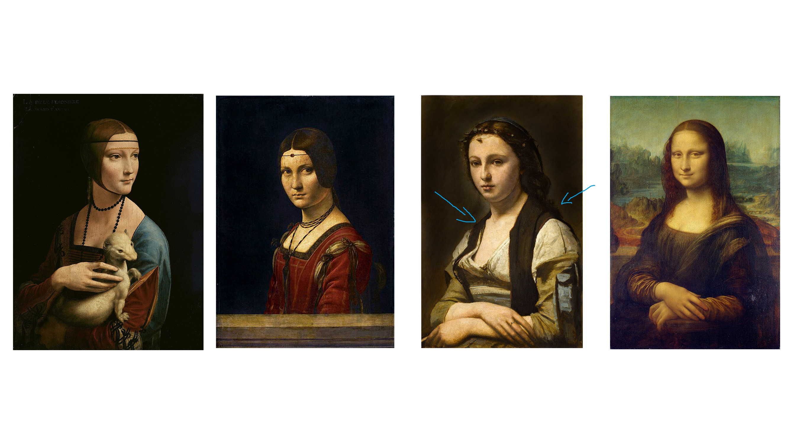
But not only did Corot’s portrait resemble so much to Leonardo Da Vinci’s Mona Lisa. There is another painting that it resembles and that’s “La Belle Ferronnière” The style of clothing and accessories are very similar. Not only the placement but the whole vibe of the aesthetic side really matches mostly the headpiece.
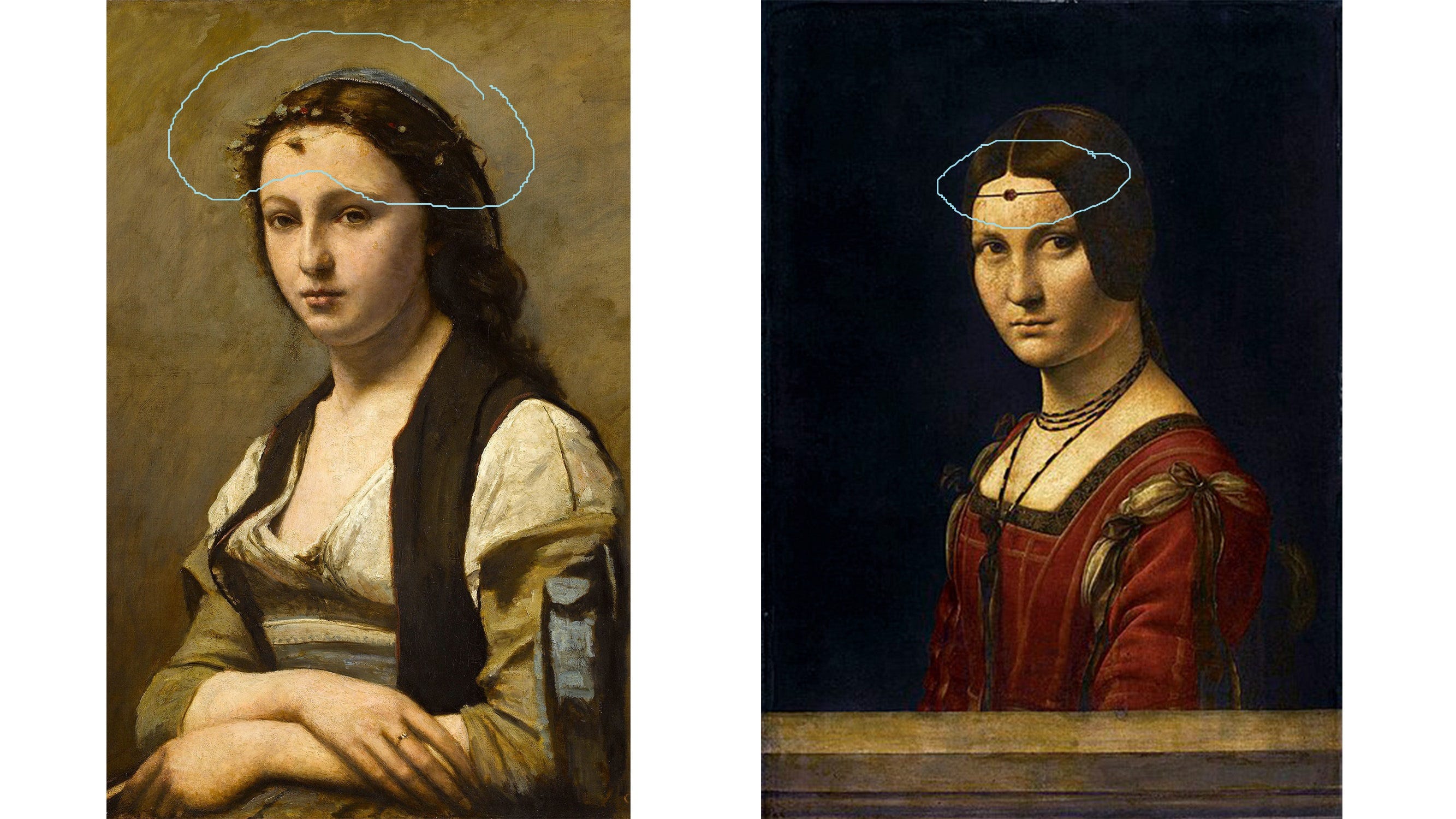
At first, I thought of another painting by Da Vinci that I referenced from. The Lady with an Ermine, but that wasn’t exactly the painting I had in mind. I’d say “La Belle Ferronnière has a closer resemblance to the style and ornaments.
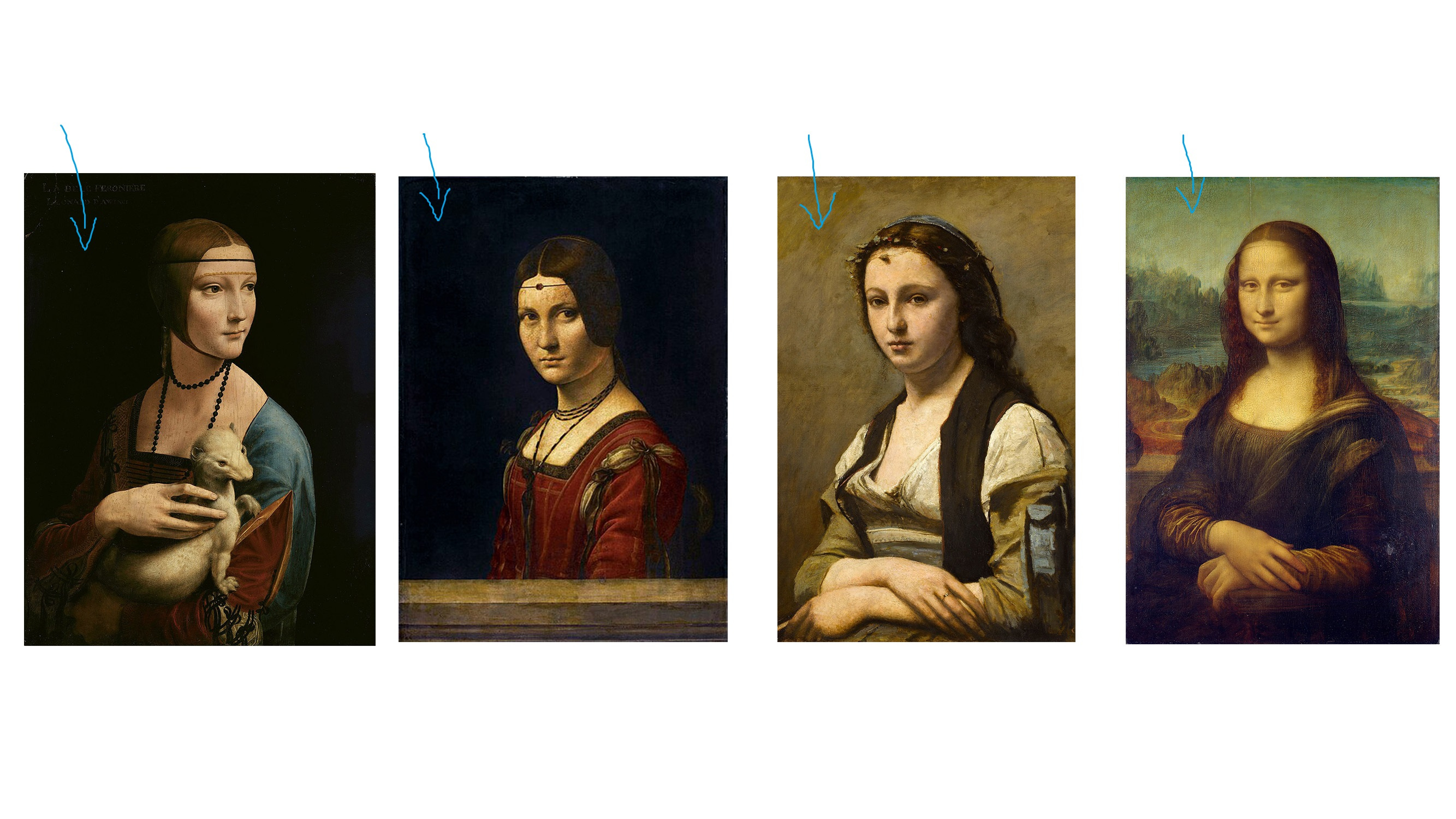
Now let’s take a look and see what these paintings have in common.
Now let’s take a look at these paintings side by side and discover what Corot’s inspiration was from these Leanardo Da Vinci Paintings.
Background
The two paintings on the left (Lady with an Ermine and La Belle Ferronnière) have a very dark background, which helps the person stand out from the deep dark shadows of the background and really lights up and brings our attention to the portrait. The Mona Lisa (Far right picture) Has a lighter background but has extra elements and details by adding some landscape to help create that depth in the painting.
Corot on the other hand chose a lighter background and kept it simple so that it does not distract us between the background and the person in front. Another reason he chose a lighter background is to build contrast between the clothing and dark hair of the figure so that it makes is more clear where the outline is.
But if Corot were to use a darker background, as you can see in the image below, the hair and the dark parts of the clothing tend to blend in a lot more and it’s really hard to see the border of where the body and the back of the head is.
Perspective
Now let’s see how they added perspective in these portrait paintings.
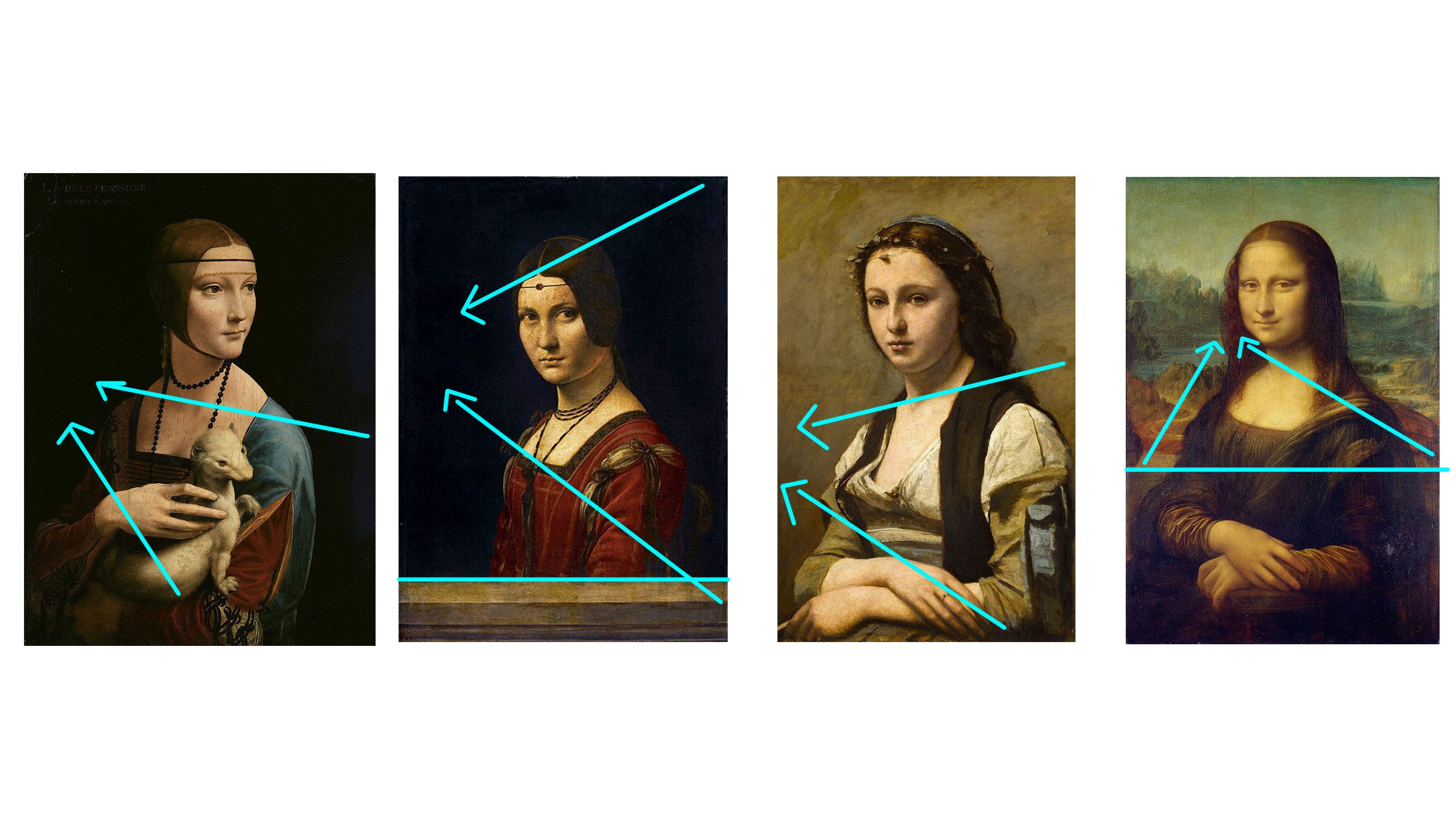
Lady with an Ermine: The perspective was mostly using different layers of subjects to create a depth of field in the portrait painting. The Ermine is closest to us where the forground is and then it move back to the lady and then into the depth and void of the dark background.
La Belle Ferronnière: The perspective is mostly made by adding an extra element wich is the ledge that is placed at the front. The ledge itself has perspective and it continues on as we move toward the lady and then into the deep dark background.
Corot’s Painting: Corot didn’t have a dark background to create more depth in that manner. But he used the figure to create perspective on its own. As you can see the different layers where the hand that’s placed in front acts as the foreground and it moves back to the chest, clothing, and the face as a second/ middle layer and surface before it reaches the 3rd surface of the background.
Mona Lisa: With the landscape as the element to show use perspective and depth. Adding the railing in from of the landscape and the figure in front of the balcony railing, creates a multi-layer of perspective and depth in the painting.
Color composition

The Lady with an Ermine’s color palette consists mainly of the colors:
Black = The background and darker shadows
White = The lightest part of the painting, the Ermine, and the ladi’s skin/ face
Blue/ Red = The Ladi’s clothing
Brown = The middle tones, shadows on the clothing and the ladi’s hair
Yellow / Gold = The ornament and designs on her sleeve

La Belle Ferronnière’s color palette consists mainly of the colors:
Black = The background and darker shadows like the hair
White = The lightest part of the painting, the ladies skin/ face
Yellow = The ornament and design on the clothing
Brown = The railing/ ledge in the foreground
Red = The dominant and main color, The clothing

The Woman with a Pearl’s color palette consists mainly of the colors:
Black = The darkest tones on the portrait, Hair, and clothing
White = The lightest part of the painting, Lady’s skin/ face and clothing
Yellow / Gold = The ornament and designs on her sleeve
Brown = The middle tones, Background
Red = The accessories and the lady’s lips

The Mona Lisa’s color palette consists mainly of the colors:
Black = The darkest tones on the portrait, Hair, and clothing
White = The lightest part of the painting, Lady’s skin/ face and hands
Brown / Yellow = The Middle tones, the bottom part of the landscape and the sleeves
Green / Blue = The landscape and Background
Composition (Do we see the golden ratio?)
Yes, we do, as you can see the composition was made by using multiple points where the golden ratio meets.

Lady with an Ermine: The Lady is placed on the right vertical golden ratio line and also the face is where the top horizontal golden ratio crosses. Da Vinci was also very smart to put the secondary subject where the bottom golden ratio line is.
La Belle Ferronnière: The lady is also placed on the right side of the vertical golden ratio line the face is where the top horizontal line is and the body is around the area where the bottom golden ratio line is.
Corot’s Painting: Corot also chose to use a similar composition. and he also added an extra where the placement of the lady’s hands is where the vertical golden ratio is on the left side.
Mona Lisa: The Mona Lisa was placed in a very interesting area. Not on, but in between the two golden ration lines, creating stability and balance in the composition. The railing is where the bottom horizontal line is and the placement of Mona Lisa’s face is where the top Horizontal Golden Ratio line is.
What did you discover?
I’m curious to see what your thoughts are on these paintings and if you also discovered something new. I would love to know! (You can comment and share your thoughts below!)
Thank you for reading my fun little discovery and I hope you also get to learn and share your discoveries too!
You can also share it with fellow friends, artists, and cellists of today's Victoria Yu Art on social media, forward it to someone who might benefit, or text it to a friend. Thanks for reading!
PS Feel free to watch my new YouTube video about this new post! Sharing thoughts and ideas!
What intrigued me most was the placement of the ring on the middle finger in The Woman with a Pearl” by Jean-Baptiste Corot 🤔