What is the color palette of a sunset?
I came upon an article in Art Every Day by GEORGE BOTHAMLEY "Albert Bierstadt - Sunset over the Plains" and found these beautiful sunset paintings from a German American artist, Albert Bierstadt.
I was curious to see what color palettes he used in order to create his beautiful romantic sunset paintings so we’re going to find out together!
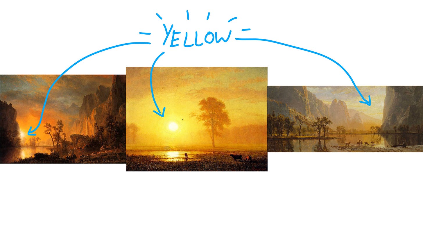
The 3 paintings we’ll be looking at are:
"Sunset over the Plains" by Albert Bierstadt
"Sunset on Rockies" by Albert Bierstadt
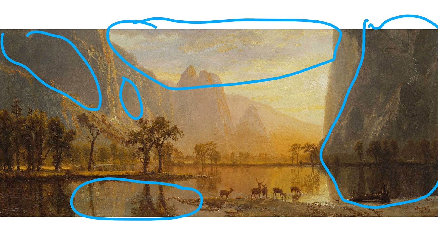
"Yosemite Valley" by Albert Bierstadt
What is the main color for a sunset?
By looking at all three paintings together side by side. We’ll be able to compare and see what’s similar between all three in order to get a beautiful sunset palette.
So far the main color is Yellow. That color is used throughout all 3 paintings here. And it is also the color we use the most in order to create a sunset vibe. The color is nice and warm and glowy creating this very magical sunset feeling.
The full-color palette was used for the 3 sunset paintings.
The full-color palette that’s used throughout the 3 paintings are
Yellow
Blue
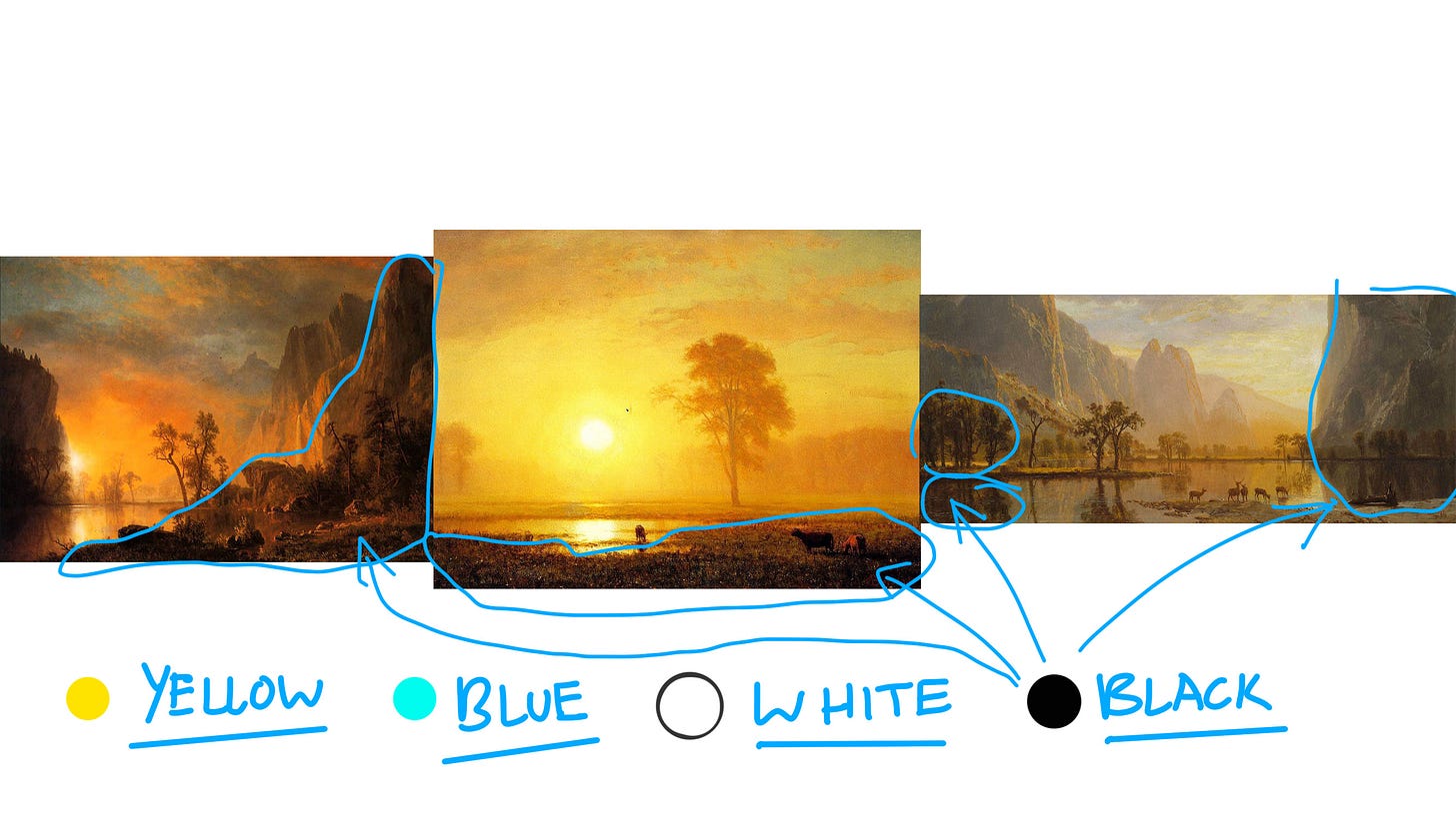
Black
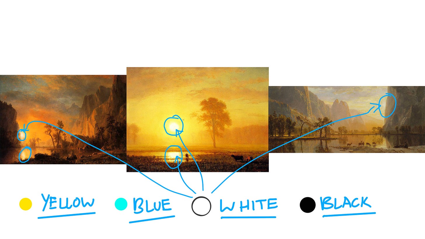
White
But let me explain how I categorized these colors because when I mean by “Blue, Black, and White” I don’t necessarily mean the “actual” color but a representational way of describing these colors.
Blue would be defined as the colder colors in the painting
Black would be where the darkest shadows and values are.
White equals the brightest part of the painting which is the sun itself.
We also used a close relative color in the color palette
Orange
Earth tones (Browns)
Color Temperature Difference Between the 3 Sunset Paintings
If we look closely at all 3 paintings, despite them all being “Sunset paintings” They each have something very unique and different. And that is color temperature.
I categorized them and I’ll explain why I categorized them like this.
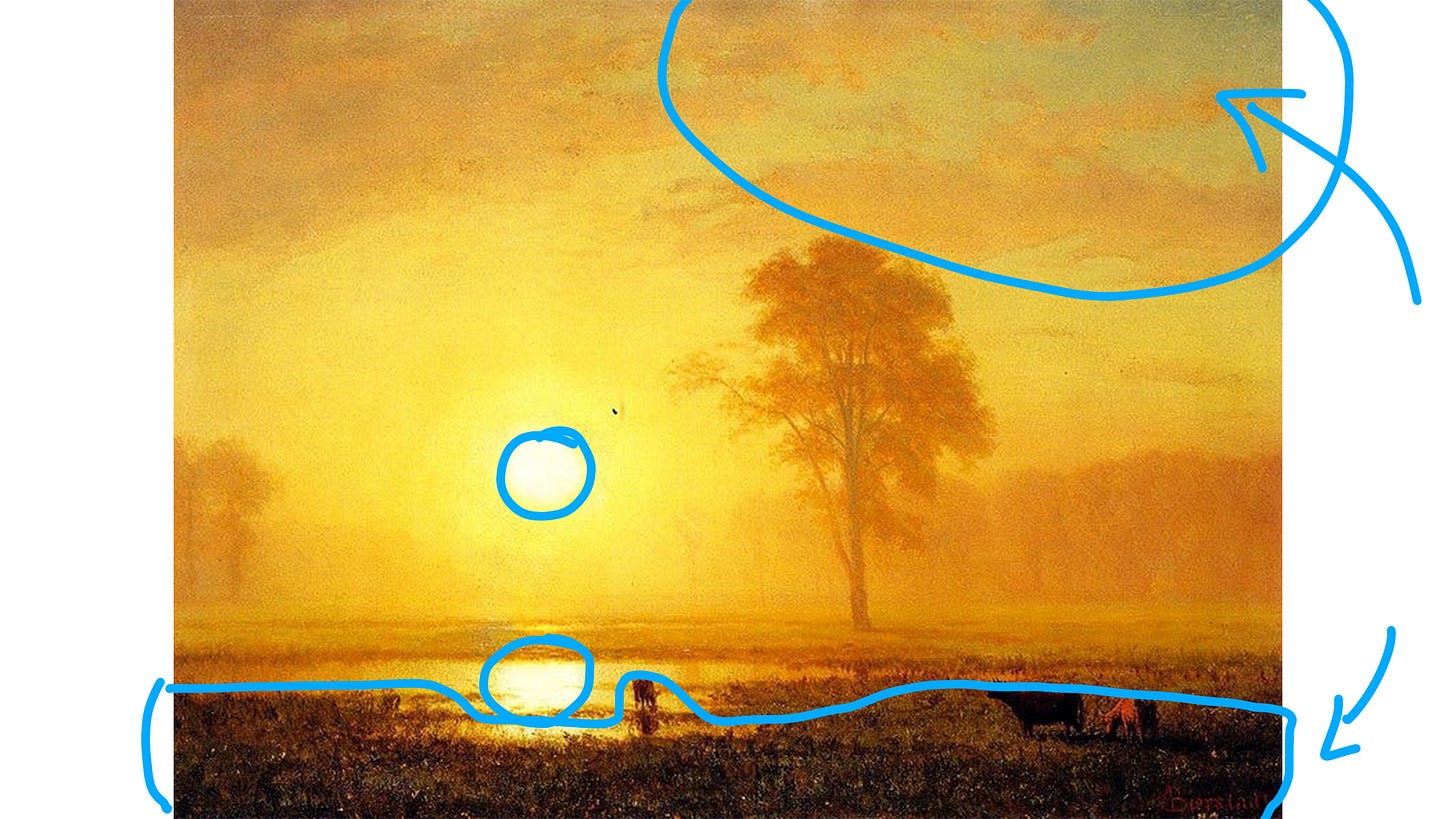
Yellow/warm = “Sunset over the Plains"
This one is very warm and yellow-intensive! But at the same time, it is balanced out by using a more neutral color and darker value tone of the shadow. And we also balanced it out with the greenish blue in the top right corner where the sky is. And also the sun would be considered the brightest part of the painting.
Orange/yellow/ warm = "Sunset on Rockies"
This is also very well balanced even though we do see a lot of the warm orange and yellow from the sunset. I divided the cooler colors at the top in a triangular shape where the sky is. And the darker shadows of the mountain surrounding the sunset. Then we would have our main focus and the most intense orange and yellow color of the sunset in the middle.
Cold/neutral = "Yosemite Valley"
Yosemite Valley is considered a lot cooler because it has a lot less yellow than the other 2 paintings. It’s a lot more neutral and less intense yellow and warm colors.
I hope you enjoyed and discovered some new things on how to create a sunset color palette and also things to keep in mind while you paint your very own sunset painting.
Feel free to also analyze and look at other sunset paintings or even sunset pictures and see what you can learn and discover from them. See how those color palettes are used in the sunset environment. Like how we did today in this article.
Have fun!
What did you discover?
I’m curious to see what your thoughts are on the combinations to create a sunset color palette. If you also discovered something new about it, I would love to know! (You can comment and share your thoughts below!)
Thank you for reading my fun little discovery and I hope you also get to learn and share your discoveries too!
You can also share it with fellow friends, artists, and cellists of today's Victoria Yu Art on social media, forward it to someone who might benefit, or text it to a friend. Thanks for reading!
PS Feel free to watch my new YouTube video about this new post! Sharing thoughts and ideas!


