


How to use Color Weight in a painting. (Color Harmony)
Learning from a photographer's perspective and apply it to paintings.

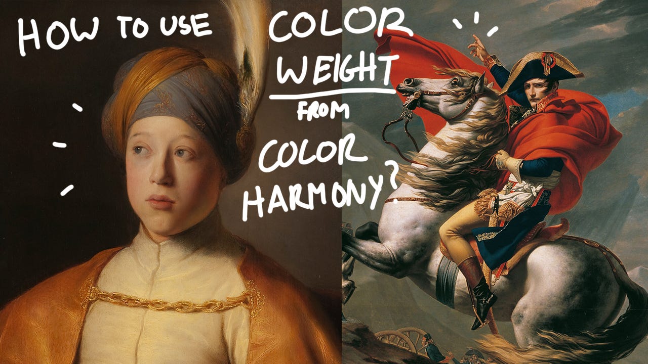
How to use Color Weight from (Color Harmony) in a painting.
I came upon this awesome photography tutorial in Joanna Kustra's video "Secrets of color-grading in photography" And learned how to use Color Weight and why it’s an important element in art and photography.
I was curious to see if we can also apply photography to paintings and learn from these two artists below.
The 2 paintings we’ll be looking at are:
"Napoleon at the Great St. Bernard" by Jacques-Louis David
"Boy in a Cape and Turban" by Jan Lievens
What is color weight?
There are 3 main factors to describe what color weight is.
Size = How much space the color takes up in a painting
Saturation = How intense or mellow the color is.
Brightness = How many shades or tints we apply to the color.
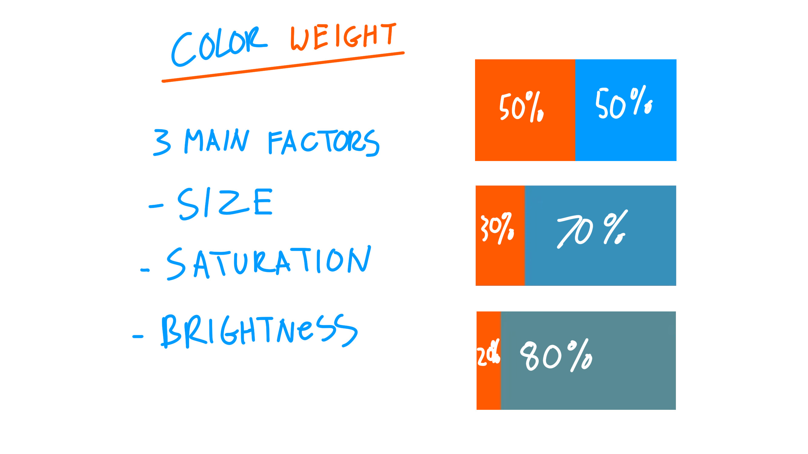
To balance out a composition of colors in color harmony. We have 3 different ways of doing it.
We either have the same intensity for both colors. So 50% for Orange and 50% for blue.
Or we can have less Orange (30%) but still keep the same color intensity and a larger size of blue (70%) but desaturate the blue color and make it less intense.
We can also have even less Orange (20%) and an even larger area of Blue (80%) But we would add more shades or tints and desaturate the color.
What makes color harmony work out very well in a piece/painting?
Why do some paintings or pictures naturally look very good? The main thing when it comes to color harmony is that we always have a “Dominant color”. Whether it’s the main subject or the main color in the piece. We need a main focus and main lead in our piece/composition.
Examples of how to use color weight.
Let’s take a look at how these two artist used their color harmony and color weight in their painting
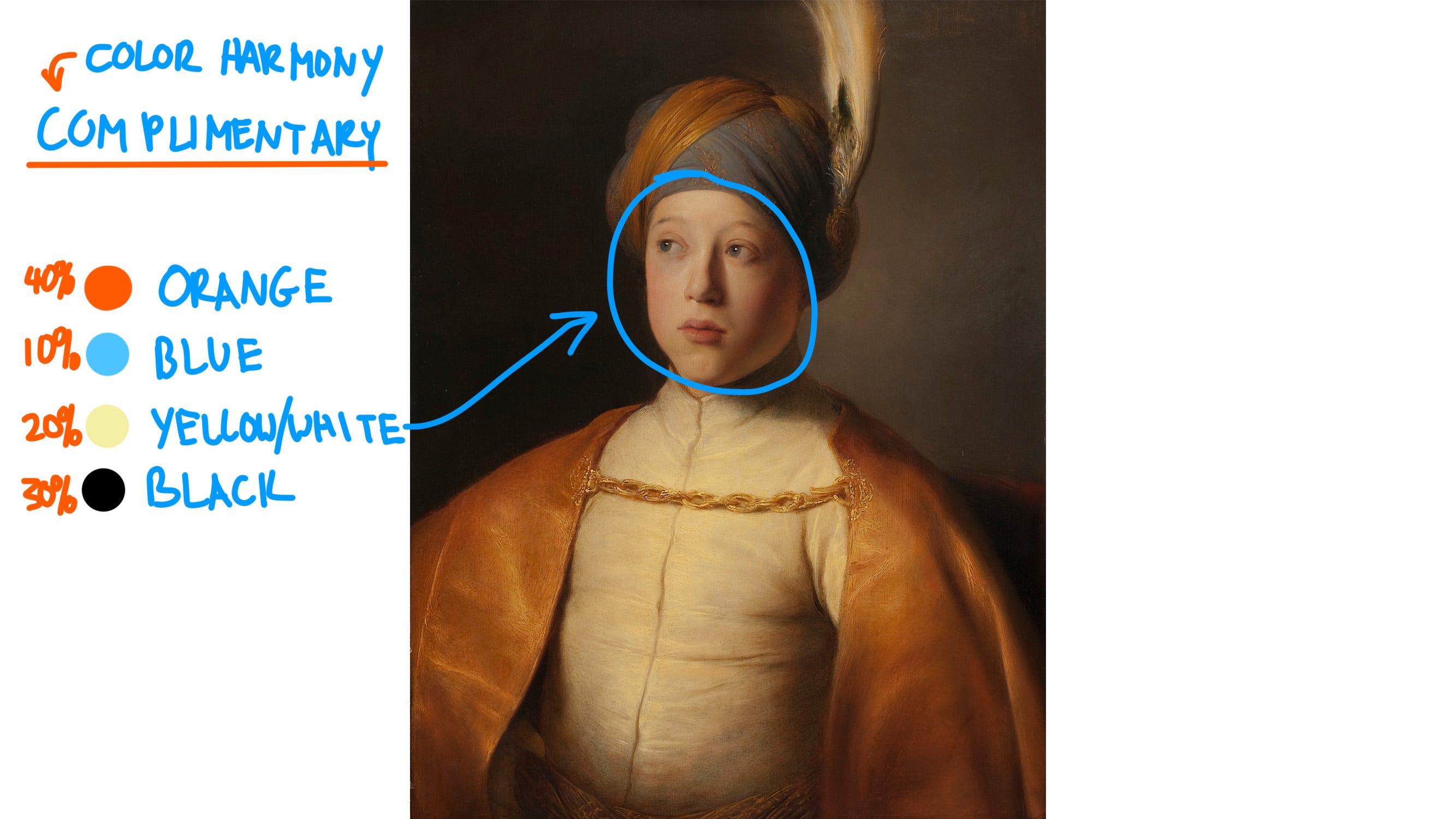
In Jan Lievens’s painting, we can see that he used a color harmony of complementary colors. (Orange and Blue)
Here is how the color weight is composed and used:
Orange = is the dominant color in this painting since it takes up 40% of the painting.
Blue = Is considered an accent in this painting since it takes the least amount of space in the painting. 10%
Yellow/white = takes up 20%. So the white shirt and the feather and also the face. Which is more neutral and brighter but not as intense and saturated in color.
Black = is the whole background which takes up 30% of the painting
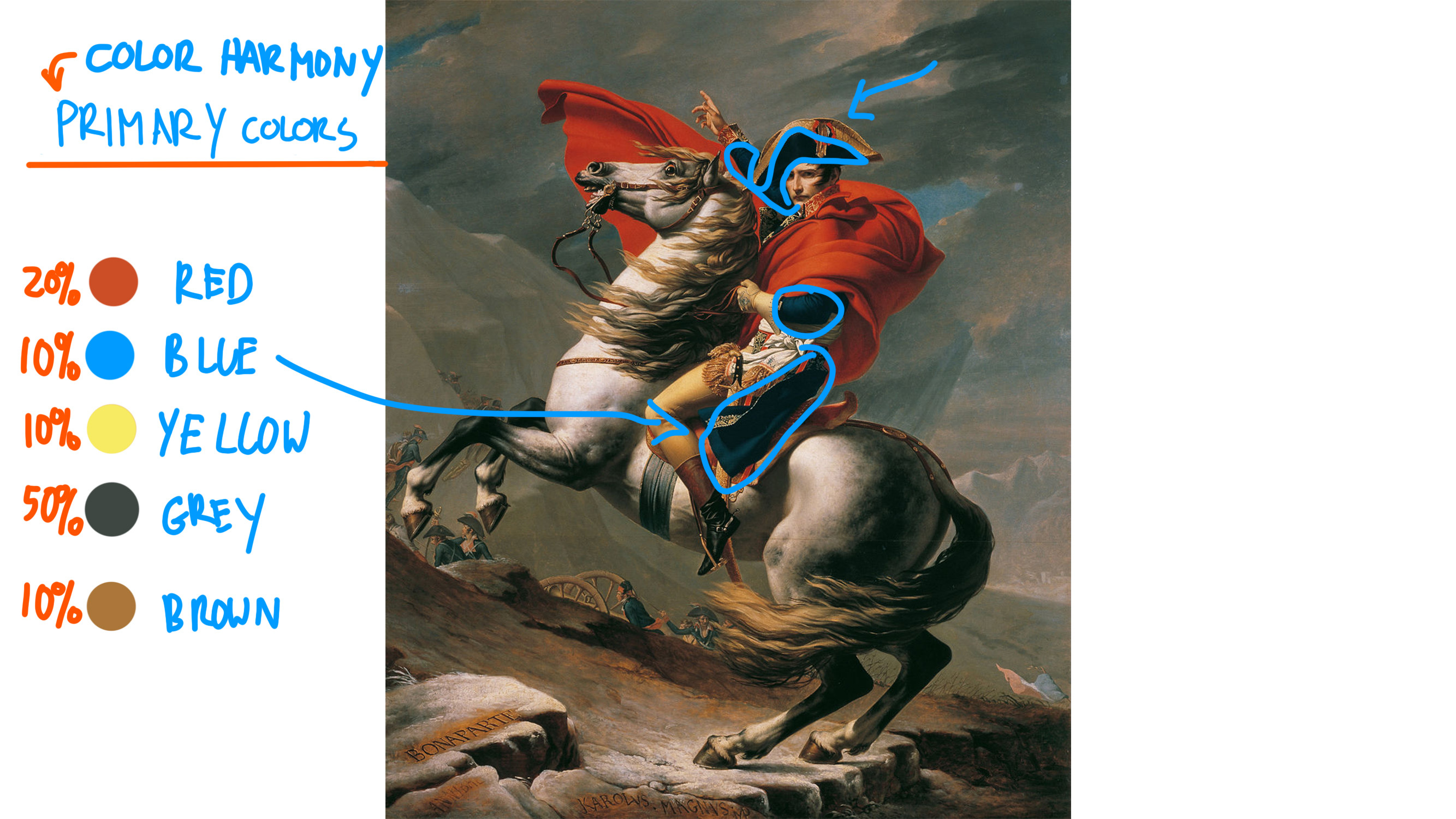
In Jacques-Louis David’s painting of Napoleon. We can see that he used a color harmony of Primary colors. (Yellow, Red, and Blue)
Here is how the color weight is composed and used:
Red = is the dominant color in this painting since it takes up 20% of the painting. Also, because, it’s the most intense color in the whole painting and attracts our attention.
Blue = are the dark blue areas of his coat, sleeve, and hat.
Yellow = takes up 10%. So his leg/pants. The golden rim of his hat and the horse hair.
Grey = Takes up most of the space of the background which takes up 50% of the painting
Brown = 10% of warm earth tones we see mostly at the bottom area of the ground /background.
Mini Exercise for you!
Feel free to try and practice to find the color weight from one of your favorite paintings or pictures. See if you can discover what color harmony it has and also how it’s organized, placed, and used. So that you can also create something similar and play around with the colors to see what would look good.
Have fun!
What did you discover?
I’m curious to see what your thoughts are on how to user color weight to balance our your composition. If you also discovered something new about it, I would love to know! (You can comment and share your thoughts below!)
Thank you for reading my fun little discovery and I hope you also get to learn and share your discoveries too!
You can also share it with fellow friends, artists, and cellists of today's Victoria Yu Art on social media, forward it to someone who might benefit, or text it to a friend. Thanks for reading!
PS Feel free to watch my new YouTube video about this new post! Sharing thoughts and ideas!